
Velocity: A Bat's Eye View of Velocity
Purpose
There are a number of useful ways of modeling (representing) motion. Graphing position, velocity, and acceleration versus time is a good choice since the rise and fall and shape of a graph are analogous to the changes in these quantities. In this lab, we'll create position and velocity graphs of an object with constant velocity. At the end of this lab, you should be able to do the following.-
•Observe a moving object and draw position vs. time (x-t) and velocity vs. time (v-t) graphs of its motion.
-
•Look at an x-t or v-t graph and describe the motion that produced it.
-
•Look at an x-t graph and draw the corresponding v-t graph.
-
•Find displacement, Δx, from a v-t graph.
-
•Use the Sketch
 and Screenshot
 tools for creating and and saving figures and uploading them for grading.
Equipment
- Dynamics Track simulation
- VPL Grapher
- Pencil
Simulation and Tools
Open the Dynamics Track simulation to do this lab. You will need to use the VPL Grapher to complete this lab. Watch Video Overview.Discussion
We all know that bats use sound to locate objects in their environment. What about humans? Could we do this, too? Suppose you were a good distance from a wall with no other objects around. If you clapped your hands and listened for the echo off the wall, you'd notice that the wait time between clap and echo would vary according to your distance from the wall. Knowing the speed of sound in air (about 330 m/s) and measuring the wait time, you could calculate the distance to the wall. If you walked toward the wall, you'd notice a steady decrease in the wait time due to the decreasing distance the sound has to travel. Likewise, moving away from the wall would steadily increase the wait time. So, you can actually determine your distance from the wall and your direction of motion just by observing the echo times and the way in which they change. The virtual apparatus used in this lab includes a device called an ultrasonic motion sensor. It emits a sound, receives its echo, and with the help of a computer, calculates the distance to the reflecting object. Ours does this about 100 times a second and provides us with a table of position-time data as well as a graph of position versus time. We'll bounce our ultrasonic sound waves off a cart moving along a track.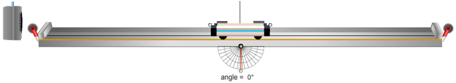
Figure 1: The Dynamics Track
Familiarize Yourself with the Apparatus
Let's try graphing. Click on the cart and drag it to the middle of the track. Click on the Sensor to turn it on. It has its own on/off switch. You should see a horizontal red line begin to form about halfway up the x-t graph. Turn off the motion sensor. (You'll always want to turn off the motion sensor when you aren't using it.) Scroll down in the data table and note the cart's position at midtrack. It should be at about 1.0 m. Try it again, but this time turn on the motion sensor and then move the cart from side to side. Get the idea? Notice that the graph and data table clear each time you turn on the motion sensor. Do this again, this time making sure that you move the cart all the way in each direction. Use your data table to note the minimum and maximum positions obtainable by the cart.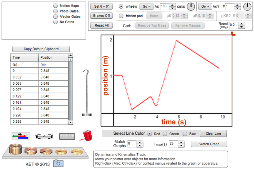
Figure 2: The Dynamics Track Apparatus
Learn How to Do the Following
-
1Display the ruler
 above the track. Note how it can be dragged up and down.
-
2Turn the brake on and off using the Brakes On/Brakes Off toggle button.
-
3Use the "Vo" (initial velocity) tool and Go button
 to launch the cart at a known positive or negative velocity.
-
4Change the color of the lines drawn on the graph, using the "Select Line Color" tool. Do you have to clear a line before overwriting it?
-
5Change the time scale of the graph using the "Tmax(s)" tool. Reset to normal,Tmax = 10 seconds.
-
6Change the way the cart recoils when it hits the track ends, using the "Recoil" tool. Reset to the normal setting of Recoil = 0.2.
Uploading Graphs and Sketches for Grading Using the Screenshot and Sketch Tools
In this lab, you'll be asked to upload screenshots (captured images) for grading. Sometimes these will be screenshots of a graph or some part of the apparatus. Sometimes you'll be asked to create a sketch on screen, create a screenshot of your sketch, and then upload it. See the introductory materials for details on the use of the Screenshot
and Sketch
tools provided in many of the virtual labs.
When you create a screenshot, you'll first save it locally to your hard drive, a thumb drive, or similar. The filename to use will be provided in the lab document like the one you're reading now. For example, a little later in this lab you'll be asked to "take a screenshot of the graph produced by the apparatus, save it locally as "Vel_IB1a.png", and then upload the file." You'll save the file locally with that name. Then when you're asked to upload it, WebAssign will include a file requester that looks something like the image below. (Note: this may display differently in different browsers and the button may say something different, such as Browse... instead of Choose File.)

Using Grapher – Graphs, Best Fit Lines, Slopes, Areas, Saving Data
The Dynamics Track data table contains position versus time data. You'll be using this with our Grapher tool. Let's try it. Move your cart to the left end of the track. Adjust Tmax to 25 seconds. For the following, don't stop until you've gone over and back twice as directed. If you run out of room, try again. Turn on the motion sensor. Drag the cart to the right quickly, then back fairly slowly. Continue by doing the reverse—dragging to the right slowly, then returning to the left quickly. Turn off the motion sensor. Congratulations, you've made a capital M. (See Figure 3(a).) If not, give it another try. Hopefully, the graph's shape already means something to you, but let's go a bit further. Click the Copy Data to Clipboard button. Your data is now in your computer's clipboard. You could paste it into a number of software programs such as Excel®. We'll use our Grapher tool because it lets us manipulate the data in ways that are useful in physics. Open Grapher. Click in the box below "Click in the box below and hit Ctrl+V to paste data." Type Ctrl+V. That is, hold down the control key and type v. By convention, the independent variable, time, appears in the x-column in the data table. The dependent variable, position, appears in the y-column. You'll see what the other columns are for soon. You'll see an M just like the one in the Dynamics Track graph. To adjust the scale of the two axes, click the Man button, short for Manual scaling. Try 20, 0, 2, 0. Click Submit, and then Close. Edit the axes labels to "Position (m)" on the ordinate and "Time (s)" on the abscissa. (To save room, we don't include titles in the graphs.) Let's also shrink the graph a bit by clicking the check boxes beside the "2" next to the Graphs button. You can see that we can add a third graph but won't need to in this lab.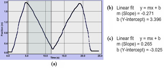
Figure 3: (a) The "M"; (b) and (c) Linear Fit Data
1
In Grapher, click at a point somewhere in the graph a bit to the right of the time when the first of the two inside segments begins. (See the left edge of the shaded area in Figure 3(a) at about 5.3 seconds.)
2
Drag to the right. A gray box will appear. Continue dragging until you're near the end of that segment and then release (at about 12 seconds in Figure 3(a)).
The vertical position of the mouse pointer is unimportant when you're dragging horizontally.
3
By doing this, you have also selected the data associated with this section of the graph. We can then use some other Grapher tools to analyze this data. Let's try it.
4
With the data still selected, click the "Linear Fit" check box. Data will now appear in the "Linear Fit" data box. Grapher has drawn the line of best fit for that part of your graph in pink. The values for the M-graph shown in Figure 3(a) are displayed in Figure 3(b).
5
Now repeat for the next segment to the right, the rising segment inside the M. You now have a second line of best fit. Its data will appear in the text box as shown in Figure 3(c). The two slopes are –0.271 m/s and 0.0265 m/s. These slopes are the average velocities, Δx/Δt, for these two segments. They are calculated using a mathematical technique called linear regression.
A word of caution: You many have seen slopes appear that are way off. Right now I'm seeing –0.060, for example. What gives? Without clicking, move your mouse pointer up and down, crossing back and forth between graphs 1 and 2. A line of best fit is drawn for each graph. But the data displayed is for the highlighted graph, the one you have your pointer over.
Procedure
Please print the worksheet for this lab. You will need this sheet to record your data.
I. Position
IA. Motion Away From the Motion Sensor
Set Tmax to 10 seconds. Set Recoil to 0. Turn off the cart brake. (You'll want it off for all the steps that follow.) You'll use the motion sensor throughout this lab. You'll turn it on just before you start a trial and then turn it off afterward. OK, let's collect some data and plot a graph. Part 1a: Slow Speed1
Position the cart at the left end of the track. Start it moving at a slow speed to the right using the "Vo" tool and Go button
 . Use 20 cm/s for Vo.
Careful with units! The "Vo" selector is in cm/s, but our graphs will be plotted in m/s.
And, remember, you'll always want the motion sensor running during each trial.
Is the entire graph significant? If not, what parts are?
There will often be extraneous segments on your graphs that should be ignored. This step of the lab is called "Motion Away From the Motion Sensor." And you're told to use a speed of 20 cm/s. You should be able to tell which part of the graph represents this slow, constant speed away from the sensor. In this case, you should have a straight line that rises at an angle of less than 45°. (If not, try again.) The extra parts of the graph are not significant and should be omitted from your sketches.
2
Sketch the graph in the space provided in Graph IA1a. (Never mind. It's already done for you this time, along with Graph IA1b and Q2, Q3, and Q4! The non-scratched-out parts are the "significant" parts referred to above.)
3
Repeat with another trial at a faster speed of 50 cm/s. The sketch (Graph IA1b) is again pre-drawn for you.
You should see now why we're using the same scale for each graph. Otherwise, we couldn't make comparisons between related graphs.
Graph IA: Motion away from the motion sensor
4
What is similar about the two graphs (NOT THE MOTIONS, the shapes of the graphs)? Remember to just look at the significant, constant velocity part of the graphs. (The answer is given below to make it clear what you're looking for.)
- They are both straight lines.
5
What is different about the two graphs? (The answer is given below to make it clear what you're looking for.)
- Graph IA1b has a steeper slope.
6
What does the slope of a position-time graph indicate about the motion of the cart? (The answer is given below to make it clear what you're looking for.)
- Velocity (both speed and direction)
Your analysis—answers to questions, etc.—should deal only with the significant parts of the graphs.
IB. Motion Toward the Motion Sensor
We'll now repeat Part IA, but this time the cart will start at the right end and move to the left. (Use a negative Vo.) Part 1a: Slow Speed1
Launch the cart at –20 cm/s.
Graph IB: Motion toward the motion sensor
2
Take a Screenshot of the graph produced by the apparatus, save it locally as "Vel_IB1a.png", and then upload it.
3
Repeat with another trial at –50 cm/s. Save your Screenshot as "Velocity_IB1b.png", and upload the file.
4
What is similar about the two graphs?
5
What is different about the two graphs?
6
Look at the graphs in Part IA and the corresponding graphs in Part IB. What attribute of a position-time graph indicates the direction of motion? Explain how this works for motion in each direction.
Creating Prediction Graphs for Uploading
In the Purpose section of this lab, it was stated that one goal was to learn to look at a graph and describe the motion that it represents. That's why we say that a graph can be used as model of a motion. Similarly, you need to be able to do the reverse—look at a motion and sketch a graph that describes that motion. You can then check your prediction using the graph produced by the Dynamics Track. It doesn't matter so much if your prediction is correct or incorrect. What's important is that you have a clearly reasoned prediction that you can check against the experimental result. That's where the learning happens. For example, suppose you said, "OK, the cart starts out sitting still for two seconds, so nothing should appear on the graph during that time." When you look at the graph that's created on-screen, you'd see that there was a horizontal line during that time, and it's located a height on the graph corresponding to the position of the cart when it was sitting still. That information tells you how to correct your original thinking. Without that original thinking, there may be no lesson learned. After you make your sketches in your lab document, you may be asked to use the Sketch tool to create an on-screen sketch. You'll be asked to do this so that you can then take a screenshot of the sketch to upload. We'll try that in a moment.IC. Making Prediction Graphs
Part 1a: Prediction Please step away from the cart . . . The label of the next graph is . . . Prediction . . . You can't make a prediction graph after seeing the graph generated by the apparatus. Instead, you'll do everything except start the sensor, and then create a prediction of what the graph of the observed motion would look like. So, follow instructions (a–c) without using the sensor. Then use the numbered instructions that follow to create your graph sketch on the grid provided (IC1a).-
aSet Recoil to 0.3. Set Vo to 50 cm/s. Place the cart at the left end of the track.
-
b(Do not use the sensor here until step 6.) Let the cart sit still for two seconds.
-
cLaunch the cart (Go). Let it continue until the ten seconds run out. Stop the motion sensor.
1
Instruction (b) said to let the cart sit still at the left end for 2 seconds. What would that look like on an x-t graph?
As you discovered earlier, when the cart is at the left bumper, its position, x, is about 0.075 m, just below 0.1 m.
So it's at about 0.1 m at t = 0. And it's still there at t = 2 s.
Draw a point on graph a at (t = 0 s, x = 0.1 m).
Repeat for (2 s, 0.1 m).
What would go between those two points? Lots of points = one line. Draw a line between the two points.
2
Instruction (c) says "Launch the cart."
How long should it take the cart to reach the right end of the track? It travels about 2 m at 50 cm/s. That's 4 seconds.
So it's at a bit less than 2 m (1.925 m) at 6 seconds. Draw a point at about (6 s, 2 m).
3
What goes between the points at 2 and 6 seconds? From Part IA, you know what a constant, positive velocity looks like on a graph, so add that.
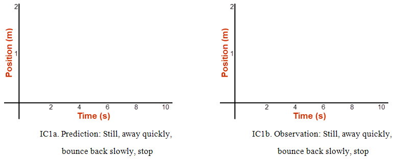
Graph IC: Prediction and observation graphs
4
It's going to bounce back off the right end and then travel until the ten seconds run out. Its speed will be slower because of the 0.3 recoil. You know what a negative velocity looks like from Part IB. Go ahead and add that to your graph. Just guess at the slope.
5
Now that you've hand drawn your sketch, you need to draw it on the lab screen to upload. You should be able to recreate your sketch using the Sketch tool discussed earlier.
-
•Click Sketch in the Dynamics Track simulation. Whoa—big change! You have an extra, editable graph now.
-
•Drag the black box on the right downward to move the x-axis to a position near the bottom of the graph.
-
•Edit the axes labels and number ranges to match the built-in position-time graph below it. Then use the first two sketching tools—the dot
 and the line
 —to reproduce your prediction graph.
-
•Use the Screenshot tool to capture the on-screen sketch, save it locally as "Vel_IC1a.png", and upload the file.
6
It would be nice to do a real trial now and compare. Fortunately, when you Exit Graph, you don't lose your drawing.
Click the Exit Graph button and set up the initial conditions. Follow instructions (a–c), this time using the sensor.
7
Click Sketch again and voila! Both graphs appear together. How'd you do?
8
Sketch your actual observed graph in the space provided in Graph IC1b.
9
Use the techniques you followed above using Sketch to create, save, and upload "Vel_IC1b.png". Don't start from scratch. It should just be a minor edit of what you did for "Vel_IC1a.png".
10
Use Copy Data to Clipboard, and create a position vs. time graph with it in Grapher.
11
What about the motion does a horizontal segment on a position-time graph indicate?
12
What does the recoil of 0.3 mean? Be specific. You'll need to analyze the data to find the velocities (slopes) like you did with the M-graph.
ID. Interpreting a Graph
Let's see how much skill you've developed in relating the motion of an object and its x-t graph.1
Describe the motions that would produce the graphs shown below. Be sure to discuss relative speeds (how fast or slow relative to one another) and directions (right or left). For example, your answer might (incorrectly) read: "starts out fast to the right, stops, continues faster to the right, stops, reverses direction and goes to the left at the same speed as in the first segment." (Note that brevity is OK here.)
You should have a statement for each of the five line segments on each graph.
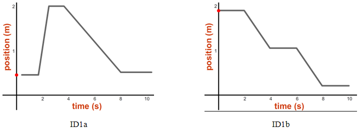
Graph ID: Graphs to interpret
2
If you'd like some confirmation of your answers, try the lab's "Match Graphs" tool with graphs ID1a and ID1b. When you select that tool, the graph appears and the little red ball will rise and fall on the position axis as you drag the cart from side to side. Just pick a graph, drag the cart until it's at the position where your graph starts, and then turn on the sensor. Then drag the cart to try to keep the line tracing the pre-drawn graph. It's hilarious. Using Tmax = 25 is a good idea. It's very challenging, but if you do it perfectly, you might win a fabulous plush toy. Probably not, though.
II. Velocity
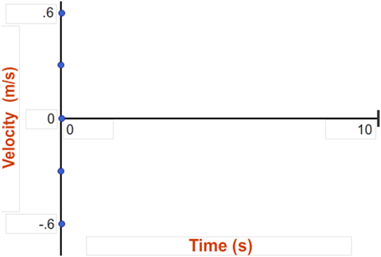
We've seen that our x-t graph is an analog, a model, of the motion itself. But there's more. The graph contains the data necessary to create the corresponding velocity vs. time graph. We'll explore that now.IIA. Motion Away From and Then Toward the Motion Sensor
Looking back at Part IA, we see that the cart moved slowly (IA1a), and then quickly (IA1b), away from the motion sensor. In Part IB, it did the same, but toward the sensor. We'll now create velocity-time graphs for these motions. Part 1a: Slow Speed Away From Sensor1
Set Recoil to 0. Recreate your first position-time graph by launching the cart with an initial velocity of 20 cm/s. Be sure to start quickly enough so that there is a horizontal section on both ends of the graph. One way to do that is to use the Delay Clock
2
Using the Sketch tool, create a velocity vs. time graph that looks like Graph IIA below. The dots are inserted to help you read the velocity scale. They're located at approximately ±0.6, ±0.3, and 0. Be sure to include them. You'll use the Sketch tool and this v-t graph for the rest of this section.
3
Look at your just-created x-t graph to see the time when the cart started moving. You know that the velocity is 0.2 m/s at this time. Put a dot on the v-t graph representing the velocity at the time when the cart starts moving. That would be at (your start time, 0.2 m/s). Add another dot for the last time when the cart is moving at 0.2 m/s, just before it hits the bumper.
4
What about the velocity between these two times? If the velocity is constant, then you'd have a succession of dots between your initial and final dots; A.K.A., a line. Add a horizontal line to indicate the cart's motion at a constant 0.2 m/s.
5
We'll find the velocity line for 50 cm/s a different way.
-
aWith the Dynamics Track, launch the cart at 50 cm/s from the left end, just as you did previously with 20 cm/s.
-
bCopy Data to Clipboard.
-
cPaste the data into Grapher as before, using the Ctrl+V technique.
-
dCheck the box for Graph "2" to display it. Click the Man button on the top graph. Adjust its graph scales to 8, 0, 2.0, 0. Submit and Close. Click the Man button on the bottom graph. Adjust its graph scales to 8, 0, 0.6, –0.6. Submit and Close. Label the axes appropriately for velocity vs. time, including units.
6
Both of these graphs hold the value of the cart's velocity. Here's how to find it. We could use any time interval, but let's use an approximately 2-second interval to examine each graph, perhaps from 2 to 4 seconds or 2.5 to 4.5 seconds. Just pick one. I'll use 2 to 4 seconds in my example.
-
aIn the x-t graph, click anywhere along the vertical graph grid line at 2 seconds. Drag to the right until you reach the 4-second line and release the mouse button. Click the "Linear Fit" check box. This will produce a straight line and populate the data box.
-
bDo the same thing for the v-t graph, except this time click the "Stats" check box. This will populate the "Stats" data box. Roll over (put your pointer in) the top graph and check the slope of that graph in the "Linear Fit" data box. Then roll over the bottom graph and note the mean value of that graph, in the "Stats" box. They should both say approximately 0.50. The slope of the x-t graph, Δx/Δt is ~0.50, the average velocity. The average value of the v-t graph, ~0.50, is the average for what is plotted for our second interval on that graph, also the velocity.
7
What do the slope of the position-time graph, including its sign, and the mean value of the velocity-time graph (the height of the line), including its sign, measure?
8
Note that the line on the v-t graph in Grapher is just what you need to add to Graph IIA1a that you're building with Sketch. Be sure to draw this line for the same time interval as the one in Grapher. This should be more than 2 seconds. A bit less than 4 seconds.
Now for the trip back to the left.
9
Repeat the necessary steps above to create the third graph line using –20 cm/s. Use the slope of the position-time graph.
10
Repeat the necessary steps above to create the fourth graph line using –50 cm/s. Use the mean value of the velocity-time graph.
11
Take a Screenshot of the four-line graph, save it as "Vel_IIA.png", and upload the file.
Graph IIA: Velocity vs time graph
12
What is similar about the four velocity-time graphs (not the motions, the graphs)?
13
What is different about the velocity-time graphs for 20 cm/s and 50 cm/s (other than their lengths)?
14
What about the motion does a horizontal segment on a velocity-time graph indicate?
15
What about the motion does the height of a horizontal, straight-line v-t graph indicate?
16
How is the direction of motion indicated by a velocity-time graph?
IIB. There and Back Again: From Velocity to Displacement
So we've found that we can determine the velocity of the cart from the slope of the position-time graph or the height of the velocity-time graph. Let's see what the velocity-time graph can tell us about the displacement, Δx. We'll use a motion similar to what we used in Part IC.1
Set Vo to 80 cm/s, set Recoil to 0.5, and move the cart to the left end.
Using the Delay Clock to help you start the timer right before you launch the cart, run a few trials. We want the cart to reach the right bumper before t = 4 s. It should then bounce back and reach the left bumper well before the ten-second clock expires. We're only interested in this trip over and back. See Figure 4. (The x- and y-axis numbering may not be the same. That's OK.)
2
Once you have a good run, Copy Data to Clipboard, and use Ctrl+V to create an x-t graph with Grapher. You should have something shaped like Figure 4a, but it might be shifted to the right or left.
3
If graph #2, the v-t graph, is not displayed, click its check box to display it.
Adjust your graph scales to (10, 0, 2, 0) for the x-t graph and (10, 0, 1, –1) for the v-t graph. Label the right or left axes, including units.
We now want to use the velocity-time graph can tell us about the displacement, Δx.
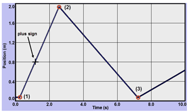
Figure 4a: (x-t)
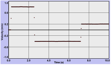
Figure 4b: (v-t)
The Examine Tool:
If you turn on "Examine" and move your pointer over a point such as the + sign in the x-t graph in Grapher, you'll see some numbers appear in the Examine data box
If you turn on "Examine" and move your pointer over a point such as the + sign in the x-t graph in Grapher, you'll see some numbers appear in the Examine data box
(e.g., (1.25, 0.51)).
These numbers represent the (time, position) at a given point. That is, 1.25 seconds after the sensor started, the cart was at 0.51 m.
4
Three points, 1–3, have been added to Figure 4. Using the Examine tool just described, find the (t, x) values for each point.
5
Using this data from the x-t graph, calculate the displacement of the cart for the three intervals listed and record them. Be sure to include signs. You'll do v-t later.
6
That's all very nice, but we were promised that the velocity graph would produce these displacements for us. You should have found the displacement from point 1 to point 2 to be approximately equal to the displacement from point 2 to point 3, but with opposite signs. And you should have found the displacement from point 1 to point 3 to be approximately equal to zero.
This is logical since the distance from bumper to bumper is the same both ways. And the displacement is equal to the distance, except the displacement for the trip back is negative to reflect the motion in the negative direction. Likewise, the overall displacement is zero since that's the distance from the starting point (initial position) to the starting point (final position). It's also the sum of two equal but oppositely directed displacements.
So what is there in the v-t graph that tells this same story? Click, without dragging, in the v-t graph in Grapher. Then click the "Integrate" check box. The integral is another calculus term that just means the area under a graph in this case.
The area between the graph and the time axis of each graph is highlighted in blue. We're just interested in the v-t graph.
7
With the Examine tool on, as you move your mouse pointer across the v-t graph, you'll see each point highlighted with a circle. Click on any point, drag, and then release at another. Only that area will now be highlighted in blue. In the "Integrate" data box, you'll see a number, which is equal to the integral, the area under the graph you've just selected. The units of that measurement are the product of the units of each axis—m/s × s—which equals meters. So the area you selected is actually equal to the displacement, Δx, during the time interval you selected.
8
Select an area under a section of the first horizontal line on the v-t graph. Note the area, Δx, in the "Integrate" data box. Repeat for a section under the second horizontal line. There is something different about the two values that is very significant. What is it and what does this difference represent about each of your chosen displacements?
9
So the total displacement for the first horizontal line should match the value of x2 – x1 in your data table in step 5. Try it. You'll have to make a judgment call about your choice of your first and last points. Using the lone dots between the velocity axis and the horizontal line are a good bet. Record the displacement value from the data box in the WebAssign question in the v-t column. Both values for x2 – x1 should be about the same.
10
Why does the change in height of the x-t graph, x2 – x1, equal the area of the v-t graph? For a constant velocity, it's pretty easy to see. The height of the v-t graph is the velocity. The width of it is t2 – t1 = Δt. So the area is
As we'll see in an upcoming lab, it even works with a nonconstant velocity.
11
Using the v-t graph, record the velocity of the cart for the three intervals listed. Be sure to include signs.
The second displacement, x3 – x2, is the displacement in the negative direction, thus, the negative area.
The third displacement, x3 – x1, is the total displacement for the trip over and back. So it has approximately zero area.
12
One last thing: Look back at the fourth bullet in the Purpose section. Why are we finding Δx? Why not just x?
Suppose our track was actually one meter longer. And suppose we moved our starting point one meter to the right. All our position data would be increased by one meter. The x-t graph would be one meter taller and all the lines would move one meter higher on the graph.
But our v-t graph would be unaffected since it's based on the slopes, which are found from Δx/Δt. And Δx doesn't reflect position, only change in position. A rise from 1 m to 2 m is indistinguishable from 2 m to 3 m. So our velocity graph can just allow us to calculate changes in positions, that is, displacements, not actual positions.
It's the same with our equation Δx = xf – xo = vavgt. With vavg and t, we can find how far we've been displaced, but without knowing where we started, xo, we can't find out where we are, xf. So to find out our actual position we'd use xf = xo + vavgΔt.