
Motion of a Simple Pendulum
Purpose
-
•To determine which factors do and which factors do not affect the period of a simple pendulum
-
•To derive an equation that describes the mathematical relation between the period and the factors that affect the period
-
•To test this equation by comparing its prediction of the g on the moon to the known value for gmoon
-
•To see how the known behavior of the pendulum can be used to experimentally determine the value of g on an asteroid
Equipment
- Virtual Pendulum apparatus
- VPL Grapher
- Pencil
- Physics Lab Introduction
Simulation and Tools
Open the Virtual Pendulum simulation to do this lab. You will need to use the VPL Grapher to complete this lab. See video overview at http://virtuallabs.ket.org/physics/apparatus/01_pendulum/. After logging in on the WebAssign website, click the link "Motion of a Simple Pendulum." When the lab opens, click "VPL Grapher" under Simulation and Tools. This will load the Grapher program in its own tab. You'll switch back and forth between the "Motion of a Simple Pendulum" tab and the "Grapher" tab as needed.A Quick Look at the Apparatus
A measuring tape and protractor allow you to measure the length of the pendulum and the (angular) amplitude of its motion. Try them by clicking in their check boxes. Leave the measuring tape on. Rotate the handle on the spool to change the length of the pendulum. The length is measured from the top end of the moving part of the string, the point of attachment, point 1, to the center of the bob, point 2.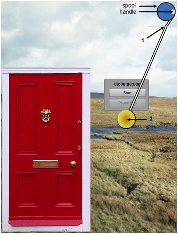
Figure 1: The Pendulum Apparatus
Historical Note:
This is being written on the day that the Washington Monument was damaged by an earthquake.
This is being written on the day that the Washington Monument was damaged by an earthquake.
Upload graphs for grading using the Screenshot
 tool.
In the
introductory materials the procedures for using the Screenshot and Sketch Graph tools are explained. Be sure to study the Physics Lab Introduction for the complete details. You'll get some practice with these procedures in this lab. You'll be asked to take screenshots (captured images) of your graphs, save them locally on your computer, and then upload them for grading.
It is highly recommended that you print out each of your figures and attach them to a printed copy of this lab document.
The filename to use for each image will always be provided. For example, a little later in this lab you'll be asked to save a Screenshot as "Pend_I.png" and then upload it to WebAssign.
tool.
In the
introductory materials the procedures for using the Screenshot and Sketch Graph tools are explained. Be sure to study the Physics Lab Introduction for the complete details. You'll get some practice with these procedures in this lab. You'll be asked to take screenshots (captured images) of your graphs, save them locally on your computer, and then upload them for grading.
It is highly recommended that you print out each of your figures and attach them to a printed copy of this lab document.
The filename to use for each image will always be provided. For example, a little later in this lab you'll be asked to save a Screenshot as "Pend_I.png" and then upload it to WebAssign.
Introduction
The obvious behavior of a pendulum worthy of investigation is its repetitious back and forth motion. Galileo is thought to have been the first person to work out the behavior of a simple pendulum, that is, the relationship between the period of a pendulum and its physical parameters. The period, T, of any repetitive motion is the time required to complete one cycle. If you pull a pendulum to one side and release it, the time for the complete trip over and back is its period. Since Galileo's discoveries, the pendulum has been an important device for keeping time. It's so reliable that it can even be used to detect the variation in the strength of Earth's gravitational field from one point to another on the Earth. We want to reproduce Galileo's work in this lab and find out just what does and does not affect the period of a pendulum. A simple pendulum is one where all the mass can be considered to be concentrated at one point far away from the point of attachment. In this lab, we'll assume that we have a simple pendulum where a small spherical mass constitutes the "bob" of the pendulum. For a spherical bob, we can further specify that its center of gravity, C.G., the point where the force of gravity can be said to act, is at its center. What do you think might affect the period of a pendulum? Suggest at least three possibilities and record them in WebAssign. State these choices as hypotheses using direct or inverse proportions. Discuss your choices with your partners before finalizing your list. I'll get you started by suggesting an incorrect hypothesis just to give you the idea.-
•The period of the pendulum is inversely proportional to the radius of the bob. (Wrong.)
Procedure
Please print the worksheet for this lab. You will need this sheet to record your data.
I. Amplitude, θ – Maximum Angle of the String from the Vertical
We're going to look for any relationships that the period might have with the amplitude of the swing, the mass of the bob, or the length of the pendulum. We'll start with the relation between the period and the amplitude of the swing.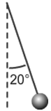
Figure 2: Pendulum with an amplitude of 20°
1
Select Earth as your location from the left drop-down selector, and select the door as your reference object from the center drop-down selector. You'll also need to get the pendulum bob to the bottom of its swing. To do that just click the handle on the spool. (This is also useful for stopping the pendulum's motion. It's hard to catch!) We'll use the gold mass for this part of the lab. So what is its mass? You're given that its density is 19,300 kg/m3. Its mass is related to its density by the equation
where density is in kg/m3, mass is in kg, and volume is in m3.
To find the mass, you need to know the volume. If you don't know the equation for the volume of a sphere, you'll need to look it up. To use this equation, you'll need the radius of the bob, r. Turn on the "Measuring Tape." Pull the tape reel down below the bob. Make any measurements you need. Notice that each small graduation counts 4.0 cm, which is a pain. Let's measure to 0.1 cm. Right click on the screen somewhere on or near the bob, and choose "Zoom In." You can do it multiple times.
Important Note:
Ignore the grey band around the spherical bob. It's just there to help you see the edge of the bob against a variable background. See the top and bottom arrows in Figure 3 which indicate the actual top and bottom of the bob for measurement purposes.
Ignore the grey band around the spherical bob. It's just there to help you see the edge of the bob against a variable background. See the top and bottom arrows in Figure 3 which indicate the actual top and bottom of the bob for measurement purposes.
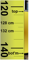
Figure 3: Diameter Measurement
Show your calculations of the mass of the gold bob. BE CAREFUL WITH UNITS!
2
Record your mass, in kilograms. If you want to check the price, just Google "price of gold." (Yikes! $58,473.74/kg on 8/18/11, $48,485/kg on 5/20/13, $42,313/kg on 6/27/14. Not so great an investment.)
3
Zoom out. Adjust the pendulum's length to somewhere between 1.200 and 1.500 m. Record the length to 0.1 cm. See step one for instructions about exactly what length to measure. Now hide the tape measure.
Remember, the length is measured from the top end of the moving part of the string to the center of the bob.
4
You now want to measure the period of the pendulum when released at various angles (amplitudes). You have a protractor to measure the amplitude. How could you make the most accurate determination of the period?
If you measure the time for one swing cycle, you'll have what you want, but the uncertainties in the measurements of the start time and the end time are pretty significant relative to the short duration of one swing. If you measured the time for 10 swings, you'd have the same amount of uncertainty since there's only one start and one stop. But the relative uncertainty (relative to the total time measured) would be one tenth as much, a much better result. There is a column in Table 1 for the full 10 swings and another for the time for one swing, the period, T. Got that? T = time for 10 swings/10.
So, if you measure the time for 10 swings to be 23.34 seconds, then T = 2.33 s. You'll never time just one swing!
5
Find the period for an amplitude of 5°. Record your results in Table 1. It may be a stretch, but let's record our times to a precision of hundredths of a second, as shown above. All of your time values should reflect this precision.
6
What do you think will happen to the period when you increase the amplitude? Why? Explain your reasoning carefully. (This is an introductory lab. Just do your best to come up with an explanation for these predictions.)
7
Take the necessary data to complete Table 1.
Read the essay "A Note About the Graph Scaling" now. (It uses data from real physical equipment, but that's immaterial.)
8
You'll start by entering your data into Grapher. There's an x-axis column, and a y-axis column. You'll want to enter your independent variable in the x-column and your dependent variable in the y-column. (The last two columns won't be used in this lab. And when they are used, they'll be automatically populated using calculated values.)
Grapher initially provides space for 14 data pairs with 10 showing at any time. Use the vertical scroll bar to display any data outside of this range. If you need more than 14 data pairs, which you will in this lab, you can add rows at the bottom of the table with the Add Rows button. You can add new rows at any time, but only at the bottom.
There are two ways to efficiently move from cell to cell while entering data.
-
•Click the Tab key after entering each value in the table to fill in one row at a time.
-
•Click the Enter key after entering each value in the table to fill in one column at a time.
9
Using the Tab key method, enter the first nine data pairs—5 through 45 degrees. After you've entered your final y-value, click Tab or Enter to alert Grapher that you've finished with the final cell.
When you began adding data, Grapher didn't know how you want it plotted, so it started with a default range of –10.0 to +10.0 on both axes. It also had some "seed" data in the data table which all fit within those ranges. As you added data, overwriting the seed data, some of your data points began to replace the seed data. (Incidentally, using Clear before starting will delete the seed data.) But eventually you stopped seeing changes in the graph. This is because your data points were outside of the default minimum and maximum x- and y-values set for the graph. There are two ways of resetting those ranges, a crude and quick and often bad way called Auto, and the best way called Manual.
Click the Auto button. The graph scales adjust to include space for the data you've entered. Note the nonzero starting point on the y-axis. Bad form. But at least you do see all the data. Crude and quick!
Any new data added will be plotted as you enter it, but you'd have to use Auto to adjust the graph for any data outside the most recently set boundaries. You could also just not worry about the graph until you've entered all your data and then click Auto.
10
You'll need some more rows, so add four more rows before you continue. (You can't add too many.)
Using the Enter key method, enter the rest of your data, a column at a time, clicking Auto from time to time.
You should now see the reason for the graph scaling essay. Graphing using Auto, which just makes the smallest graph possible, suggests that the period increases dramatically with amplitude. But if you actually look at the y-axis, you see that the change in period is very small—just a few tenths of a second. We'll generally want to set our axis ranges manually. You can do this at any time during the graphing process. Let's do it now.
11
Click Man for manual. The four entries requested are the minimum and maximum values for each axis. Generally the minimum values will be zero and the maximum values will be somewhat higher than the largest values in our data. Let's use 100 for our maximum amplitude and 3 for our maximum period. Enter those four values and click Submit.
Grapher is still learning about adjusting the number of grid lines used in cases like this. You may sometimes find that the increments are odd. Sorry if that happened in this case.
12
Double-click in the default graph title and change it "Period vs. Amplitude." Click and drag the title to center it near the top of the graph.
Do the same for the axis labels. (These can't be dragged.) Be sure to include units. Use "Period (s)," and "Amplitude (degrees)." Sorry no ° signs are available.
13
Click the check boxes to turn on Graphs 2 and 3 to reduce the size of your graph. (Leave these on throughout the lab.) Take a Screenshot of your graph and save it as "Pend_I.png". Then upload the file for grading. Here's a reminder from the introductory materials about taking screenshots and uploading them.
-
aStart by clicking the Screenshot
icon. Your mouse pointer will change to a crosshair
 .
.
-
bWithout clicking, move the crosshair to the top-left corner of the area you want to capture. That area would be the top graph along with all the labels on the x- and y-axes. Click and drag to the bottom-right corner of the capture area and release. (You can actually use any two diagonally opposite corners.)
- When you release the mouse button a file requester will pop up. Navigate to wherever you want to save your captured image and change the default name to "Pend_I.png". Be sure to include the ".png" at the end.
-
cYou'll see a WebAssign file requester like the one below. Click Browse and search on your local device for "Pend_I.png". Click on the file name and then click Open. The file requester will close and you'll see the file name beside the Browse button. You're done.

-
dIf you need to replace the file just repeat the process using the same name. Also, if you forget the ".png" extension, you can edit the local file name to include it and then do the upload.
- You can print out and attach your Screenshot in the space on the PDF.
II. Mass
This time we want to see what effect the mass might have on the period. To make sure you've isolated this one variable, keep the length the same as in Part I and use an amplitude of 10°. Vary the mass by using each of the five bobs provided. Start with the least dense and use each in order of density. You'll need to calculate and record each mass using the same method as before with the gold bob. They all have the same volumes.1
Find the period for the wooden bob. Record your result as Trial 1.
2
What do you think will happen to the period when you increase the mass? Why? Explain your reasoning carefully.
3
Take the necessary data to complete Table 2.
4
How do we describe the relation between these two variables? For guidance, look at Graphical Analysis Summary in the Physics Lab Introduction. There are seven categories of graphs that we find in this course.
5
Plot a graph of period versus mass using Grapher. Be sure to start the graph at (0, 0) and label your axes.
6
Remember to keep the check boxes checked to turn on Graphs "2" and "3" to reduce the size of your graph. Take a Screenshot of your graph and save it as "Pend_II.png". Upload the file for grading. You can print out and attach your Screenshot in the space on the PDF.
7
Why do you think that (within error) you found the mass to have no effect on the period of the pendulum? Explain your reasoning after discussion with your lab partners.
III. Length
This time we want to see if the pendulum's length has an effect on its period. To make sure you've isolated this one variable, use the gold bob again and an amplitude of 10°. (Make sure the door is showing on the simulation.)Hint:
Adjusting the pendulum length with any precision seems difficult at first, but there's a trick which works with our apparatus. Suppose you need to make a slight adjustment in string length. This requires that you turn the spool through a small angle as shown in Figure 4a. On your screen this means that you need to move the pointer just a few pixels which is very difficult to do with a mouse. Being off a pixel or two results in a large difference in angle and string length. Try this instead. Click on the handle and drag your pointer to the right as shown in Figure 4b. Then drag upward as shown in Figure 4c. The knob has now been turned through the same angle as in Figure 4a, but at this greater radius, being off a pixel up or down corresponds to a much smaller change in spool angle. You've effectively made the spool much larger in radius. You can actually go all the way to the edges of the screen, even outside of the browser window or onto another monitor!
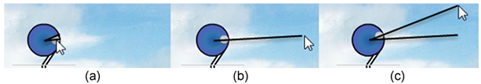
Adjusting the pendulum length with any precision seems difficult at first, but there's a trick which works with our apparatus. Suppose you need to make a slight adjustment in string length. This requires that you turn the spool through a small angle as shown in Figure 4a. On your screen this means that you need to move the pointer just a few pixels which is very difficult to do with a mouse. Being off a pixel or two results in a large difference in angle and string length. Try this instead. Click on the handle and drag your pointer to the right as shown in Figure 4b. Then drag upward as shown in Figure 4c. The knob has now been turned through the same angle as in Figure 4a, but at this greater radius, being off a pixel up or down corresponds to a much smaller change in spool angle. You've effectively made the spool much larger in radius. You can actually go all the way to the edges of the screen, even outside of the browser window or onto another monitor!
Figure 4: Fine Adjustment of String Length
1
Find the period with the shortest pendulum we can make—about 0.600 m long. Remember, the length is from the slot that the string passes through to the center of gravity of the bob. Record your result as Trial 1, t1 in Table 3. Take two more time measurements, t2 and t3, and then record the average of t1, t2, and t3 as tavg. Compute the period, T, of your pendulum and record it in your table.
2
What do you think will happen to the period when you increase the length? Explain your reasoning carefully.
3
Take the necessary data to complete Table 3. Use a range of lengths from approximately 0.600 m up to approximately 2.200 m in approximately 0.2-m increments.
4
This looks more interesting. Why do you think that you found the length to have an effect on the period of the pendulum? Explain your reasoning.
5
The horizontal line indicating no relation in Part II was easy to pick out. But like the slightly curvy one in Part I, this one is a bit trickier. Enter your length and time data into Grapher so that you can take a closer look.
Make sure that you follow the data table and graphing guidelines in the introductory materials.
Be sure to use Manual mode and set the graph origin at (0, 0). And be sure that you think about what "Period vs. Length" tells you about which measurements go on each axis.
Could this be a linear relation? Click and drag across the graph just click in the graph to select the whole graph. Click the "Linear Fit" check box. It could be linear data, but the points are probably not varying randomly above and below the line. It's more like they're below the line at each end and above it in the middle. That definitely looks like a consistent curvature. Let's assume that we have nonlinear data.
6
Given our assumption above that the data is not linear, is the period directly proportional to the length?
It would be nice if we had some more data for shorter lengths. If we did, we'd see that the graph curves dramatically downward at shorter lengths. It actually passes through (0, 0)!
7
Look at the Graphical Analysis Summary in the Physics Lab Introduction. There are seven categories of graphs that we find in this course. Assuming that the period versus length graph does fall dramatically to (0, 0) as stated above, which graph type does this illustrate?
8
What you should have is a quadratic proportion with a side-opening parabola. (Feel free to change your previous answer.) Clicking on Quadratic Fit will produce a very nice section of a parabola.
With all three graphs turned on as usual, take a Screenshot of your graph, and save it as "Pend_III.png". Then upload the file for grading. You can print out and attach your Screenshot in the space on the PDF.
Turn off Quadratic Fit. We won't use that tool in our graphical analysis. We'll always linearize our graphs to determine the relationships indicated by our data. To confirm that this is the correct relationship, linearize your data by plotting y2 vs. x, or specifically, T2 vs. L. You should be able to do that using what you've learned from the introductory materials.
Here are the steps.
-
aClick the Graphs button. In the first row, labeled "2:", select Y^2 to plot y2 vs. x. That is,
T 2 vs. L. -
bUsing Manual mode, edit the x- and y-axis scales.
-
cClick and drag across the full graph or just click in the graph to select all the data. Since "Linear Fit" is already selected, you'll see the linear fit line drawn to match the new graph scales. You should see that the data fits a linear model very nicely.
Important Note:
If you move your pointer over each graph, you'll see that the linear fit box values will change to go with the graph that your pointer is in. Be careful to place your pointer in the correct graph! No clicking is required.
If you move your pointer over each graph, you'll see that the linear fit box values will change to go with the graph that your pointer is in. Be careful to place your pointer in the correct graph! No clicking is required.
9
Using the slope and y-intercept from the "Linear Fit" data box, write the equation describing your data in y = mx + b
form.
Caution:
The values in the "Linear Fit" box reflect the graph that your cursor is currently in, so make sure that you read off the slope and y-intercept values with your cursor in the second graph.
The values in the "Linear Fit" box reflect the graph that your cursor is currently in, so make sure that you read off the slope and y-intercept values with your cursor in the second graph.
Be sure to substitute T 2 for y, etc. And don't forget the units on the slope and y-intercept.
The Mathematical Relationship Between the Period and Length of a Simple Pendulum at Small Angles
The y-intercept of your equation indicates the point where your graph crossed the vertical T 2-axis. That is, it represents the value thatT 2
was approaching as the length of the pendulum approached zero. While a pendulum with zero length is not possible, the graph does show the trend in the period (squared) as the length is reduced. It seems reasonable that the period should approach zero at L = 0.
Your y-intercept is probably not exactly zero, but close to it. If so, this could mean one of two things.
-
aIt could mean simply mean thatT 2increases linearly with length but has some nonzero value atL = 0.That is, there's a linear relationship but not a direct proportion.
-
bOr it could mean that the y-intercept produced by our measurements is nonzero due to experimental uncertainty. That is, the T 2 value forL = 0is within experimental uncertainty of being equal to zero. In that case, we could drop the y-intercept term from our equation and say that we have a direct proportion between T 2 and L.
C = 2πr + 0.02 m
. Does that meant that our well-known equation, C = 2πr,
is not correct? Careful analysis would show that the 0.02 m is due to experimental uncertainty. Let's check to see which of the two choices above are correct—a or b. That will tell us what to do with our y-intercept—keep it or drop it.
So how close is close enough to zero? Answering that question involves statistical techniques that we won't use in this course. But we have some tools in Grapher that will provide some guidance. The RMSE (root mean square error) value shown in the "Linear Fit" data box provides a measure of the average vertical distance of your data points from the line of best fit.

Figure 5: Period Squared vs. Length
10
Take a Screenshot of your graph and save it as "Pend_IV.png". Upload the file for grading.You can print out and attach your Screenshot in the space on the PDF.
11
List your values of the y-intercept, b, and your RMSE. Is your y-intercept within experimental uncertainly of being equal to zero?
12
Historically, with this apparatus typical values for b and RMSE are b = ±0.025 s2 and RMSE = ±0.030 s2, which would indicate that the y-intercept can be ignored. If your value for either b or RMSE is significantly larger then these, it would be good to carefully retake your data. For what follows, we'll assume that you've found acceptable data. Thus we're assuming that item b is correct in this case.
Write your equation below in y = mx
form. (Use T 2 and L, not y2 and x.)
13
Check this out with your raw data. Pick any experimental length value from your data table and see if your equation approximately produces your experimental T value. Don't forget the units.
14
If you quadrupled the length of a certain pendulum, what happens to the period (doubled, halved, etc.)? Note that this is only true because you have a direct proportion.
Hopefully, your equation was able to reproduce your data reasonably well. This is the beauty of equations. They sum up the behavior of a system in a tidy little bundle.
IV. One last factor, g
1
Suppose you took your pendulum to the top of a high mountain or, better still, to Earth's moon. What effect would you expect to find? Specifically, where would the period of a pendulum have its greatest value, on the Earth or on Earth's moon?
Let's try it. Select the bug as your reference object from the center drop-down selector. Also turn on the measuring tape and pull it all the way down the page. Notice that it now reads in millimeters. So the longest pendulum you can make is just under 12 mm. Got that? The bug is an object designed to give you a frame of reference for judging the size of things.
Set the pendulum length for 6 mm. Leave the location set to Earth.
2
See if you can determine the period of this pendulum. Ouch! Don't try too hard or it might give you a nasty headache.
The result should make sense since T 2 ∝ L. The shorter the pendulum, the smaller the period.
3
Repeat the previous test on Earth's moon. Better, but it's still a bit too fast for comfort.
4
Now try it on the asteroid Brian. Ah, that's better. (No need to take data. You get the idea.)
5
So what's the idea? Explain what you think is happening here.
6
What would be the period of a pendulum in deep space where the force of gravity is zero?
Hopefully, you said something about the pendulum speeding up and slowing down more and more slowly from Earth to Earth's moon to Brian. Experiments show that the period depends on the local value of the acceleration due to gravity, g, which is the acceleration of an object dropped in a vacuum at that location. The exact relationship is
T ∝ g–1/2 or T ∝
or T =
.
| 1 |
| g1/2 |
 |
|
g = 9.8 m/s2
means that when you drop something on Earth, it will speed up by 9.8 m/s for every second that passes. It's traveling at 9.8 m/s after 1 s, 19.6 m/s after 2 s, etc.
V. The Mathematical Relationship Among T, L, and g
Let's do a little algebra. We've found thatT 2 ∝ L and T ∝ g−1/2.
T 2 ∝ g–1 or T 2 ∝
.
| 1 |
| g |
T 2 ∝ L ×
or T 2 ∝
.
| 1 |
| g |
| L |
| g |
T 2 = k
| L |
| g |
T = k'
,
|
|
g =
=
= π2 = 9.87 m/s2.
| 4π2L |
| T 2 |
| 4π2(1.00) |
| 2.002 |
VI. One Last Thing for the Mathematically Inclined (Optional Fun)
We found earlier that the period actually depends on the amplitude too. But the actual relation is not one in our list of seven. Visit Wikipedia and search for "pendulum." You'll find equation 4 a couple of screens down. This is the form of the equation that takes into account all three variables. The θ terms are the amplitudes in radians. You'll note that to a first approximation, that is, if you just keep the first term inside the parentheses, you get equation 2

T = 2π
, our small angle approximation.
Grapher can't plot this equation to show us that it actually describes our data, but if you enter your L, g, and θ data into the equation and patiently calculate the period using the first two or three terms you'll see that the equation nicely reproduces our graph! (I don't recommend it. You probably have much better things to do than this.)
|
|
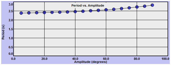
Figure 6: Period vs. Amplitude