Preparing Graphs
Graphs are often used to organize data so that relationships between numbers can be visualized. In some cases, the graph is used to directly interpolate values. That is, the graph is plotted, and then intermediate values are read directly from the graph. With modern computers, it is more common to plot values electronically, and then do a regression analysis to obtain an equation for the data. The equation can then be used to calculate intermediate values. In either case, a graph has attributes similar to those of a table.Graphs have titles:
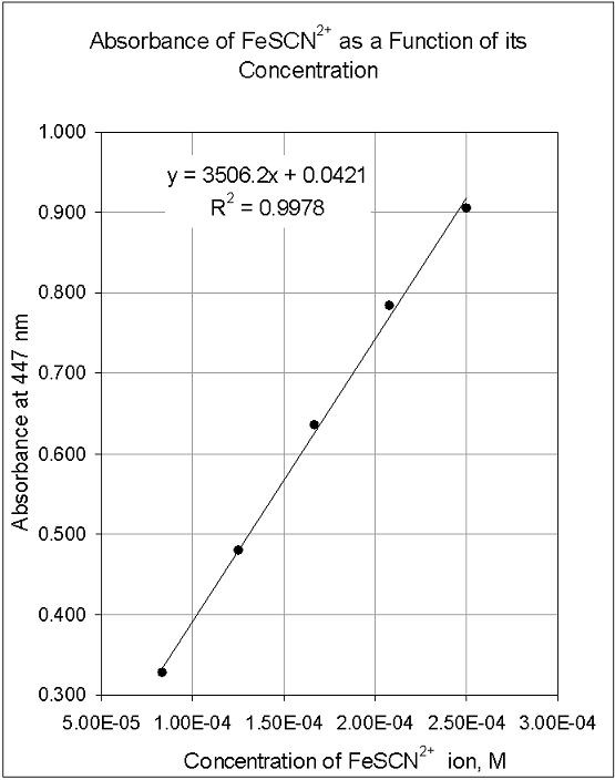
The title clearly states what values are plotted in the graph. Appropriate titles for graphs will sometimes be given in your lab instructions. If not, you can always use "Y as a function of X" but state what Y and X are, e.g. "Absorbance of FeSCN2+ as a Function of its Concentration."Label the axes:
The axes of graphs should have labels that indicate the numbers plotted and their units. In the example below, the X-axis is labeled "Concentration of FeSCN2+ ion, M" and the Y-axis is labeled "Absorbance at 477 nm." (A note: absorbance does not have units since it is the negative logarithm of a percent.)The points:
Points on graphs are drawn clearly. In a hand-drawn graph, it is customary to make a small dot exactly at the position of the data point.Regression line and equation:
If a line or curve is drawn to express the relationship between the data points, it is drawn smoothly, as a best fit, not in a connect-the-dots fashion. If a regression analysis is used to obtain the line or curve, include the equation on the graph, and the figure of merit, R or R2. The closer these values are to 1.00, the better the fit of the line or curve to the data.Use the whole page:
The space in the graph is filled with data to the extent practicable. In hand-plotted data, this involves some guesswork. For example, if one is plotting temperature versus time, one draws the graph to accommodate the possible range of data, and may not fill the space. Computers generally fill the space, but allow the user to adjust ranges if desired. If one expects to read values directly from a hand-plotted graph, it is generally drawn as large as possible, usually a full page in the notebook.Significant figures:
If one uses a regression analysis to obtain an equation, and calculates results with it, the calculated values should be expressed to the same degree of accuracy (significant figures) as the data used in the plot, unless there is excessive scatter in the data. In such cases, statistical methods are used to determine the accuracy of interpolated values. Devices such as error bars can be used to express this. The graph below has the attributes listed above. It can be used as an example for graphs in a lab notebook.
Figure
