Appendix D: Graphical Analysis
When measurements are made in the laboratory, results can be recorded as equations or as tabulated values. Although the relationship between physical quantities can be clearly expressed by these methods, a graph provides a more vivid display of these relationships. For an experienced observer, graphs can be used to determine the underlying physical laws and principles associated with the measurements made in the laboratory.1. Drawing Graphs
Since a graph is used not merely to display the results of a series of measurements but also to assist in analyzing the data, it should be designed to provide the maximum amount of information possible to a reader. The following is a list of guidelines that can be used when presenting results in graphical form.A. Choice of Axis
When data is plotted, the first thing to determine is which variable should be plotted on the ordinate scale (y-axis) and which should be plotted on the abscissa scale (x-axis). In general, if the relationship between the independent and the dependent variable is to be shown most clearly, the independent variable is plotted along the x-axis and the dependent variable is plotted along the y-axis. For most cases, the independent variables in an experiment are the quantities whose variations are controlled by the experimenter. The dependent variables are those quantities whose variations with respect to the independent variable are being measured. The axes should be clearly indicated with heavily drawn lines. If the values plotted are all positive, then all the points are plotted in the first quadrant and the intersection of the axes should be at the lower left corner of the graph (this intersection does not necessarily have to represent the zero values of both variables). If any of the numerical quantities have negative values, then the intersection of the axes should be shifted so that these points can appear on the graph.B. Scales
The scale of the axis is the ratio of the number of units of the graph to one unit of data. The size of the scale should reflect the accuracy of the values plotted and should be chosen so that the data fills most of the page. If the scale adopted is too small, the graph utilizes only a small portion of the page and the precision of the results obtained using the graph will be severely reduced. If, on the other hand, the scale is excessively large, then small deviations in the data are magnified and the general trends in the data cannot be clearly distinguished. In addition, too large a scale can give an exaggerated idea of the precision of the experimental results. In order to determine the scale, compare the range of the values for the variable and the number of major divisions along the axis of the graph paper. The scale is chosen to include the entire range of values and to allow decimal divisions to be easily determined. Convenient subdivisions of 1, 2, 4, 5, or 10 should be used but never use such divisions like 3, 6, 7, 9, or 11, since these make it difficult to plot and read values on the graph. The numbers should increase from left to right or from bottom to top along the axis. Since the numerical values for the independent and dependent variables do not generally have the same range, the scales for the abscissa and the ordinate need not be identical. In addition, the zero values of the axes do not have to appear on the plot. In linear plots, however, it is sometimes useful to have the origin of the abscissa fall on the plot in order to determine the intercept of the ordinate through this point. When numerical values are exceptionally large or small, the use of a multiplying factor such as 10, 103, or 10–4 is sometimes used. The values of the main divisions are then indicated to two or three digits and the multiplying factor is placed at the right of the largest value on the scale.C. Labeling
The name of the quantity being graphed should appear in the clear area near the axis, followed by the proper units (abbreviated in standard form) and separated from the axis label by a comma or a dash. The main scale divisions should be identified by short heavy lines drawn on the axis and the numerical values of the main divisions are recorded next to these marks. Every graph should contain a title that is a brief but descriptive statement of what the graph is intended to show. The title should be placed so that it is near the top of the graph and is clearly visible. If more than one set of data is plotted on the same graph, then a legend should appear somewhere on the graph describing the marks used to differentiate between each set.D. Plotting
Each data point should be plotted as a dot at the location indicated by its x- and y-coordinate value. The coordinates of the points are not written on the graph since they are already contained elsewhere in the report. Each point should be enclosed in a small circle so that its position will be located even if a line drawn on the graph obscures the dot. If more than one curve or set of data appears on the graph, then each set is distinguished from the others by using different symbols (triangles, squares, etc.) to surround the plotted points. If crossed error bars (which are discussed later) are used, then the circles and other symbols are omitted. Once the data is plotted, the next step is to draw a smooth curve or other interpretation for the data. The equation of the curve will represent the law connecting the two variables in question. The curve should be a smooth, continuous line except in the cases where adjacent points are connected by a straight line. Although there are statistical methods available that can be used to determine the curve that gives a "best fit" to the data, in many cases a simple visual inspection is sufficient. A clear plastic ruler (for straight lines) or a French curve (for curved lines) generates an adequate curve for most purposes. The curve need not pass through all the points, but it should be drawn so as to fit them as closely as possible keeping in mind that positive and negative errors are equally likely and small errors are more likely than large errors.E. Error Bars
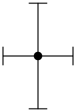
Since any measurement made in the lab has some uncertainty associated with it, it is often necessary to consider this uncertainty when plotting data on a graph. This uncertainty can be represented on a graph through the use of error bars. An error bar is a vertical or a horizontal line whose length represents the range of the uncertainty associated with a particular point. If error bars are used to indicate the experimental uncertainty, each point on the graph should have crossed error bars indicating the range of values for that particular measurement (see Figure 1).
Figure 1: Data point with error bars
2. Analysis and Interpretation
Once the graph has been constructed, a proper analysis is essential in order to obtain any generalizations or conclusions concerning the experiment. The curve identifies the empirical relationship between the two variables, the variation of one variable with respect to the other, and any trends or critical points. A graph can also be used to obtain additional values other than those plotted by reading points off the curve or by extrapolation (following the trend in the curve to extend it beyond the range of the data points).A. Linear Relationships
A linear relationship between quantities results in the graph of a straight line. This is the easiest pattern to identify from plotted points even if the experimental errors cause the points to deviate or scatter slightly so that they do not fall exactly on a straight line. (If the scattering of the data is so large that it is difficult to determine where the straight line should be drawn on the graph, then the assumption of linearity should be questioned.) A simple analysis of linear graphs can provide a wealth of new information concerning the experiment. The variation of the variables, the slope of the line, and the intercepts are a few items that can be obtained from a linear graph.B. Variation
The form of the variation of the quantities of a linear graph falls into one of two categories: linear variations or direct proportions. If the two quantities graphed are x (the independent variable) and y (the dependent variable), the direct proportion would be of the form where k is a constant. Thus the two variables take on the value of zero simultaneously and the graph is a straight line that passes through the origin (0, 0). By comparison, a linear variation is represented by any straight line graph that has the form where k and b are constants. In this case the line does not pass through the origin; instead it intersects the axes at different points. Note that ifb = 0
this reduces to Equation (1) and the relation is a direct proportion; so direct proportions are linear variations but not all linear variations are direct proportions.
C. Slope
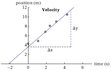
For a linear relationship of the form of Equation (2) , the slope of the straight line is defined as where both Δx and Δy are expressed using the scales and the units that have been chosen for the axes. In this case, the slope is the value for k in Equation (2). To calculate the slope using the information on the graph, two points on the line are chosen and the slope is computed from the vertical distance between these two points divided by the horizontal distance between the two points (using Equation (3)). The two points selected to calculate the slope should be within the range of data points but as far apart as possible; the farther apart they are, the more accurate is the value for the slope. The points used to calculate the slope should not include any of the data points that were plotted. The slope often expresses important facts about the relationship between the independent and the dependent variables. For example, a graph of position against time for a moving object in Figure 2 has a slope of 1.68 m/s that represents the velocity of the object.
Figure 2
D. Intercepts
The points where the graph intersects the axes are called the intercepts. These points can give significant information about the experiment. For every graph there are two intercepts: an x-intercept and a y-intercept. On the graph in Figure 2 the x-intercept (the value of x whent = 0)
is –2.15 cm; the y-intercept is 3.61 sec and gives the time when the position was zero.
E. Linearization
Although a linear relationship is easily identified from plotting points, most other relationships are not so clearly distinguishable. For example, suppose the quantities measured are related by a square law: Although the empirical relationship would be difficult to obtain from an inspection of the plotted points, the graphing and analysis can be simplified by a process called linearization. When an equation is linearized, a third variable is introduced in order to make the equation linear. For Equation (4) the new variable, z, would be defined asz = x2
and Equation (4) would be
which is clearly a linear equation. So when the values for the variables x and y are plotted, y would be plotted on the ordinate and z (or x2) would be plotted on the abscissa. Whenever two variables have a nonlinear relationship the process of linearization can be used to produce a linear function by the substitution of a new variable.
F. Uncertainty in the Slope
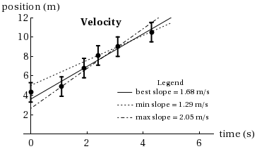
For a linear relationship, the plot of the experimental data will be a straight line. However, since the data is contaminated with random errors not all the plotted points will fall on the line. So the experimenter will draw a straight line that is judged to be the best fit line and the values (i.e., the slope and the intercept) obtained from the graph will be the best estimates of these quantities. But due to the errors in the experiment, the values of these quantities will have some uncertainty. An estimate of the uncertainty in the slope is determined graphically by drawing two other neighboring lines that fit the data reasonably well but which are obviously not the best fit. The error bars and the position of the points that lie off the best fit line should be considered when drawing the two neighboring lines (see Figure 3). The slopes (and the intercepts, if desirable) of the three lines are determined and the results can be written where a = maximum slope – best slope, and b = best slope – minimum slope.
Figure 3
2.1
m/s.
| +0.37 |
| −0.39 |
